
Learning to read a stock chart is less about math and more about understanding the story of a stock's journey. It's how you get a feel for the tug-of-war between buyers and sellers. When you can interpret the price action, spot trends, and use a few key indicators, you're making decisions based on evidence, not just a gut feeling. My goal in this guide is to move beyond generic definitions and show you how to apply these concepts with real-world context, helping you turn squiggly lines into actionable insights.
In This Guide
- 1 Why Stock Charts Are the Language of the Market
- 2 The Anatomy of a Stock Chart From Lines to Candlesticks
- 3 Spotting Market Trends and Key Price Levels
- 4 Using Technical Indicators to Confirm Your Analysis
- 5 A Practical Checklist for Analyzing Any Stock Chart
- 6 Frequently Asked Questions (FAQ)
- 6.1 1. What’s the best chart type for a beginner to use?
- 6.2 2. How do I choose the right timeframe for my chart analysis?
- 6.3 3. Can I rely on technical analysis alone for trading decisions?
- 6.4 4. Is there any indicator that is 100% accurate?
- 6.5 5. What is the difference between support and resistance?
- 6.6 6. How important is trading volume?
- 6.7 7. What are some common chart patterns I should learn first?
- 6.8 8. Does technical analysis work for all markets, like crypto or forex?
- 6.9 9. How much time should I spend studying charts each day?
- 6.10 10. What are the biggest mistakes beginners make when reading charts?
Why Stock Charts Are the Language of the Market
Before you start looking for patterns, you need to appreciate what a stock chart really is. It’s more than just a squiggly line showing a price; it’s a living record of human psychology. It’s a visual map of the endless battle between buyers (demand) and sellers (supply).
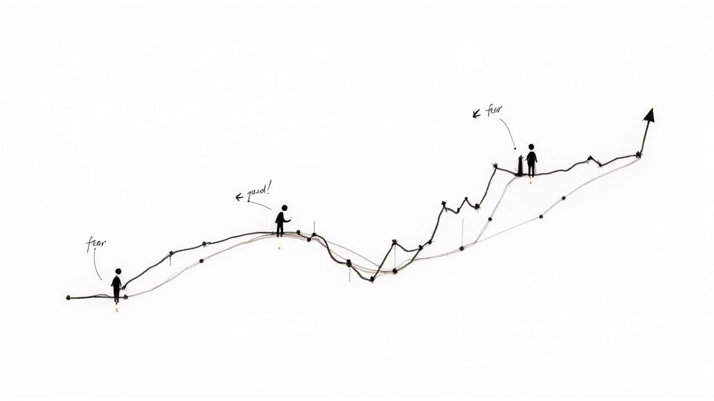
Every single tick up or down on that chart is the result of thousands, sometimes millions, of individual decisions. These decisions are fueled by the most basic human emotions: fear, greed, hope, and uncertainty.
When you learn to read a chart, you're learning to speak the market's language. This skill, often called technical analysis, is based on a simple but powerful premise: past price action can give you clues about where the price might go next. This isn't a new idea, either. The practice has roots stretching all the way back to 17th-century Dutch markets and was refined by pioneers like Charles Dow in the late 1800s.
Decoding Market Psychology
Try to see an uptrend as more than just a rising line. It's a visual confirmation of collective optimism. During an uptrend, buyers are confident and willing to pay higher and higher prices because they believe the stock is worth even more.
On the flip side, a downtrend is what fear looks like on a chart. Sellers are in control, offloading their shares and driving the price down as pessimism takes hold.
These swings aren't just random noise. They often fall into recognizable patterns precisely because human psychology tends to be predictable. We react similarly to similar situations, and that repetition is what chart analysis helps you spot. It's not about predicting the future with 100% certainty—no one can do that. It’s about stacking the probabilities in your favor and managing your risk.
By pinpointing price levels where the market’s mood has shifted before, you can anticipate potential turning points. Getting a handle on these bigger market dynamics is a crucial first step. You can go even deeper by exploring the patterns behind these shifts and understanding stock market cycles for better investing.
Key Takeaway: Think of a stock chart as a visual storybook of the market. Your job is to learn the vocabulary of that story—the trends, patterns, and signals. The better you understand the narrative, the better you'll be at anticipating the next chapter.
The Anatomy of a Stock Chart From Lines to Candlesticks
Every stock chart tells a story, and learning to read one is like learning a new language. At its core, it's simple: the horizontal X-axis is time, and the vertical Y-axis is price. The story's entire plot, however, changes depending on the timeframe you choose. A daily chart reveals a completely different narrative than a 5-minute chart.
Most people start with a simple line chart. It connects the dots—literally, just the closing prices. But relying on a line chart is like trying to understand a storm by only knowing when the rain stopped. You get the outcome, but you miss the entire battle.
Understanding Candlesticks The Trader's Choice
To really get inside the market's head, you have to master candlesticks. They are, without a doubt, the tool of choice for serious traders because each candle packs a ton of information into one small shape.
A single candlestick tells you four critical pieces of data for any given period:
- Open: Where the price started.
- High: The absolute peak price it hit.
- Low: The absolute bottom price it touched.
- Close: Where the price finished.
The thick part is the body—this shows you the distance between the open and the close. Those thin lines poking out the top and bottom? We call those wicks (or shadows), and they show the full journey from the session’s high to its low.
The color tells you who won the battle for that period. A green candle means the price closed higher than it opened—a bullish signal. A red candle means it closed lower—the bears were in control.
Pay attention to the body's size. A long, powerful green body signals strong, confident buying. A long, ominous red body? That's heavy selling pressure. This visual language is a core skill, much like the fundamentals you'd learn in an investing for beginners guide, and it sets the stage for everything that comes next.
Comparison of Common Stock Chart Types
To make the right call, you need to use the right tool. This quick comparison breaks down the three most common chart types, showing where each one shines and where it falls short.
| Chart Type | Information Displayed | Best For | Limitation |
|---|---|---|---|
| Line Chart | Closing price only. | Getting a clean, high-level view of long-term trends. | Hides all the important intraday price action and volatility. |
| Bar Chart | Open, High, Low, Close (OHLC). | Seeing the price range and key levels for each period. | Can feel a bit clinical and less intuitive than candlesticks. |
| Candlestick | Open, High, Low, Close (OHLC). | Quickly gauging market sentiment and the intensity of buying/selling. | Single candle patterns can be deceptive without the broader context. |
At the end of the day, candlesticks give you the richest, most immediate insight into the tug-of-war between buyers and sellers. When you learn to interpret their color, size, and wicks, you’re no longer just looking at a chart—you're reading a detailed story about market psychology.
Spotting Market Trends and Key Price Levels
Once you get the hang of reading the individual pieces of a chart, the real skill is putting it all together to see the bigger picture. Stock prices almost never travel in a straight line—they move in trends. Really learning how to read stock charts means training your eye to see these broader movements, because they tell you which way the wind is blowing in the market.
At any given moment, a stock is usually doing one of three things:
- Uptrend: You'll see a series of higher highs and higher lows. This is a clear sign that buyers are in the driver's seat, feeling optimistic and consistently pushing the price upward.
- Downtrend: The exact opposite, this is marked by a series of lower highs and lower lows. This tells you sellers have taken control, and pessimism is driving the price down.
- Sideways Trend (Consolidation): The price just bounces around in a relatively tight range, not really going up or down. This is a period of indecision where buyers and sellers are in a standoff.
A really simple but effective trick is to physically draw trend lines on your chart. In an uptrend, just draw a line connecting the bottom of the "valleys" (the higher lows). For a downtrend, connect the "peaks" (the lower highs). This little exercise makes the market's direction pop right off the screen.
The Psychology Behind Support and Resistance
Beyond the general trend, you'll notice prices seem to hit invisible walls. These are called support and resistance levels. They aren’t just random numbers; they're psychological battlegrounds where the market's momentum often flips. Think of them as a price floor (support) and a price ceiling (resistance).
Support is a price point where buying is strong enough to stop a stock from falling further. It’s an area where traders who missed the last run-up see a "good deal" and jump in. At the same time, sellers start to think twice. The more a stock bounces off a specific support level, the more significant it becomes.
On the flip side, resistance is a price where sellers overpower buyers, killing an uptrend's momentum. This often happens at a previous high point, where investors who bought at the top are now just itching to sell and get their money back.
This infographic breaks down how time, price, and the candlestick itself all come together to build these patterns.
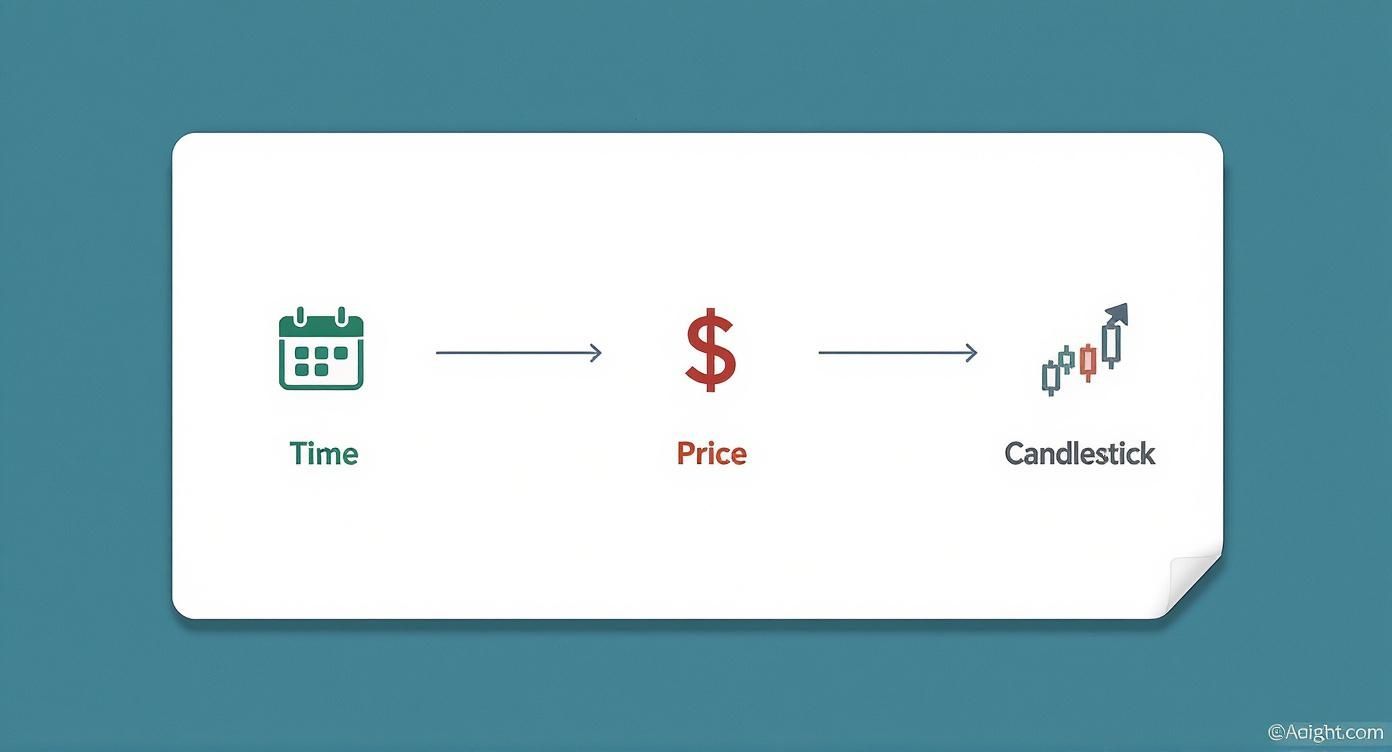
It’s a great visual for understanding how each candle is a building block, capturing a snapshot of the battle between buyers and sellers over a specific period.
You can see these forces at play on any long-term chart. One of the best ways to get a feel for this is to look at historical data for major indexes like the S&P 500. For example, after an incredible surge of 37% in 1975 and 23.83% in 1976, the market hit a ceiling and dropped by -6.98% in 1977. It's a classic example of a powerful uptrend running into a wall of resistance. For more of this kind of data, the historical returns on the NYU Stern School of Business data page are fascinating.
Key Insight: Support and resistance levels are basically the market's memory etched onto a chart. They mark spots where a big decision was made in the past, and those old decisions have a funny way of influencing what happens next.
Pinpointing these key levels gives you crucial context. It helps you anticipate where a stock might turn around and gives you a solid framework for deciding where to get in and where to get out.
When you combine trend analysis with support and resistance, you start to understand not just where a stock is headed, but why it's struggling or breaking out at certain prices. Recognizing these dynamics is a foundational skill, much like having a system for how to identify top-performing stocks in the market is essential for long-term success.
Using Technical Indicators to Confirm Your Analysis
Price action and trends tell a compelling story, but technical indicators are like getting a second opinion from a trusted expert. They add an essential layer of data to help you confirm—or even question—what you think you see on a chart.
Instead of getting bogged down by the hundreds of obscure indicators out there, let's focus on three of the most powerful and widely-used tools in a trader's arsenal.
The secret is to use them for confirmation, not as standalone buy or sell signals. An indicator should always support what the price, volume, and trend are already suggesting. One of the biggest mistakes new traders make is acting on an indicator's signal alone, which often leads to costly errors.
Moving Averages: The Trend's Compass
A moving average (MA) is one of the simplest yet most profoundly useful tools you can use. It essentially smooths out the day-to-day price noise to reveal the underlying trend direction with a single, flowing line. Think of it as the stock's average price over a specific time frame.
You'll find that most professional and retail traders keep a close eye on two particular moving averages:
- The 50-Day Moving Average: This is your go-to for the medium-term trend. When a stock consistently holds above its 50-day MA, the general sentiment is considered bullish.
- The 200-Day Moving Average: This is the heavyweight champion for the long-term trend. A stock trading above its 200-day MA is broadly seen as being in a healthy, long-term uptrend.
A truly powerful signal emerges when these two lines cross. For instance, when the shorter-term 50-day MA crosses above the longer-term 200-day MA, it’s called a “golden cross.” This is a historically bullish event that suggests momentum is shifting upward for the long haul.
The Relative Strength Index: Gauging Momentum
The Relative Strength Index (RSI) is a classic momentum indicator. It measures the speed and magnitude of price changes, oscillating on a scale from 0 to 100. Its primary job is to help you spot when a stock might be overbought or oversold.
I like to think of it like a rubber band—stretch it too far one way, and it’s bound to snap back.
- Overbought (typically above 70): This suggests the stock has climbed too far, too fast, and might be due for a breather or a pullback. It's not an automatic sell signal, but it’s a clear warning that the bullish energy could be fading.
- Oversold (typically below 30): On the flip side, this suggests the stock has dropped too sharply and could be poised for a bounce. It’s a sign that the bears might be running out of steam.
Pro Tip: Keep an eye out for divergences. If the stock’s price hits a new high but the RSI only manages a lower high, you're seeing a bearish divergence. This is a major red flag that the underlying momentum is weakening, even while the price is still inching up.
Trading Volume: The Fuel Behind the Move
Volume is easily the most underrated indicator, but in my experience, it’s one of the most honest. It tells you exactly how many shares were traded in a period and acts as a built-in lie detector for any price move. A price jump on massive volume carries far more weight than the same move on light volume.
Here’s a simple way to read the conviction behind a move:
| Price Action | Volume | What It Tells You |
|---|---|---|
| Price Rises | High Volume | Buyers are serious. This confirms a healthy uptrend. |
| Price Rises | Low Volume | A lack of conviction. The move might not have legs, so be cautious. |
| Price Falls | High Volume | Sellers are in firm control. Confirms the strength of the downtrend. |
| Price Falls | Low Volume | Selling pressure might be drying up. The downtrend could be weakening. |
High volume is the ultimate confirmation for a trend or a breakout above a key resistance level. A breakout that occurs on weak volume is often just a "false breakout" waiting to fail. Getting the timing right is everything, a concept we explore in much more detail in this investment timing guide for maximum wealth growth.
By weaving these three indicators into your analysis, you build a powerful system of checks and balances. This layered approach will allow you to interpret what the charts are telling you with much greater confidence.
A Practical Checklist for Analyzing Any Stock Chart
It’s one thing to know what a moving average is, but it's a completely different ballgame to apply that knowledge systematically every single time you look at a chart. Without a repeatable framework, it's far too easy to let emotion or a gut feeling take the wheel.
That's why I rely on a simple checklist. It's my workflow for bringing all the pieces together, helping me build a clear narrative for any chart I pull up.
By starting with the big picture and then zeroing in on the details, I make sure my short-term ideas don't clash with a powerful underlying trend. It's a simple discipline that has saved me from countless bad trades.
My Go-To Analysis Framework
Here’s the step-by-step process I use to turn theory into a practical, repeatable analysis. Think of it as building the market's story, one layer at a time.
-
Pick Your Playground (Timeframe): First things first, match the chart to your goal. If you're a long-term investor, start with weekly or even monthly charts. Swing trader? The daily is your home base. If you're a day trader, you'll be living on the 5-minute or 15-minute charts.
-
Find the River's Current (Primary Trend): Before you do anything else, zoom out. Is the stock making higher highs and higher lows (an uptrend)? Or is it making lower highs and lower lows (a downtrend)? Maybe it’s just chopping sideways. This is the single most important piece of context.
-
Mark the Battlegrounds (Support & Resistance): Now, find the price floors (support) and ceilings (resistance) where the price has turned around in the past. These are the historical spots where bulls and bears have fought it out, and they are often where future battles will be decided.
-
Read the Latest Chapter (Recent Candlesticks): Zoom in on the action from the last few days. Are you seeing big, fat green candles showing buyers are in total control? Or are you seeing long upper wicks, which tell you sellers are pushing back hard?
-
Look for Confirmation (Volume): A price move without volume is like a car without gas—it's not going anywhere. If a stock breaks out of a key level, you want to see a huge spike in volume to confirm that the move has real conviction behind it. Low volume on a breakout is a major red flag.
-
Call in the Backup (Indicators): Finally, I glance at my favorite indicators, like the RSI or Moving Averages. Do they agree with what the price is telling me? For example, if the price is breaking out and it's comfortably above its 50-day moving average, that's a great sign of bullish momentum.
Putting It All Together: A Look at the US500
Let's apply this to a real-world example: the US500 index. This index is a fantastic illustration of how charts show the tug-of-war between real-time performance and future expectations.
Over the prior month, the index climbed 2.83%, and it had soared an impressive 16.93% year-over-year. This immediately highlights the importance of recognizing both the short-term and long-term trends. Previous all-time highs often act as major resistance levels—those price ceilings where momentum can stall. It’s this constant dance between historical data and live price action that makes technical indicators so valuable. You can read more about the performance of the US stock market to see this in action.
Analyst's Insight: Having a consistent checklist takes the guesswork out of the equation. Your decisions become methodical and evidence-based, which is the foundation of successful trading and a critical step before you even think about how to choose the best stocks to buy right now.
Frequently Asked Questions (FAQ)
1. What’s the best chart type for a beginner to use?
For beginners, candlestick charts are highly recommended. While line charts offer a simple view of closing prices, candlesticks provide four key data points (open, high, low, close) in one visual. This gives you a much richer, immediate understanding of market sentiment and the battle between buyers and sellers within a specific period.
2. How do I choose the right timeframe for my chart analysis?
Your chart timeframe should align directly with your trading or investing style.
- Long-Term Investors (months/years): Use weekly and monthly charts to identify the dominant, long-term trend.
- Swing Traders (days/weeks): Focus on daily and 4-hour charts for finding entry and exit points.
- Day Traders (intraday): Rely on 1-minute, 5-minute, and 15-minute charts to capture short-term price movements.
3. Can I rely on technical analysis alone for trading decisions?
While possible, it's not ideal. A powerful approach combines both technical and fundamental analysis. Fundamental analysis helps you decide what to buy (a financially healthy company), while technical analysis helps you decide when to buy (at a strategic point based on market psychology). Using them together provides a more robust framework for your decisions.
4. Is there any indicator that is 100% accurate?
No. It is crucial to understand that no technical indicator is 100% accurate. All indicators are based on historical data and can produce false signals. The goal is not to find a perfect tool but to use a combination of indicators for confirmation, build a strategy with a statistical edge, and always practice disciplined risk management.
5. What is the difference between support and resistance?
Think of them as a floor and a ceiling for the stock price.
- Support: A price level where buying pressure is strong enough to overcome selling pressure, causing the price to stop falling and often bounce back up.
- Resistance: A price level where selling pressure overwhelms buying pressure, causing the price to stop rising and often turn back down.
6. How important is trading volume?
Volume is critically important because it measures the conviction behind a price move. A breakout above resistance on high volume is a strong, bullish sign. Conversely, a similar move on low volume suggests a lack of commitment from buyers and increases the risk of a "false breakout" or trap.
7. What are some common chart patterns I should learn first?
Instead of learning dozens, focus on a few key patterns to start:
- Continuation Patterns (suggest the trend will continue): Flags and Pennants.
- Reversal Patterns (suggest the trend may be ending): Head and Shoulders, Double Tops, and Double Bottoms.
8. Does technical analysis work for all markets, like crypto or forex?
Yes. The principles of technical analysis are universal because they are rooted in the study of supply and demand, which is driven by human psychology. As long as a market has historical price and volume data that is freely traded, you can apply these techniques to stocks, forex, commodities, and cryptocurrencies.
9. How much time should I spend studying charts each day?
This depends entirely on your strategy. A long-term investor might spend 30 minutes on a weekend reviewing weekly charts. A swing trader may dedicate an hour each evening to find potential setups. A day trader must actively watch charts during market hours. The key is not the quantity of time but the consistency of your routine.
10. What are the biggest mistakes beginners make when reading charts?
The most common pitfalls include:
- Analysis Paralysis: Overloading charts with too many indicators, creating confusion.
- Ignoring the Primary Trend: Trying to trade against the market's main direction.
- Lack of Confirmation: Acting on a single indicator signal without supporting evidence from price or volume.
- Forcing Trades: Seeing patterns that aren't there out of a desire to be in the market.